TWID #35: Design for Scientists
Building a website to teach scientist the basics of visual design.

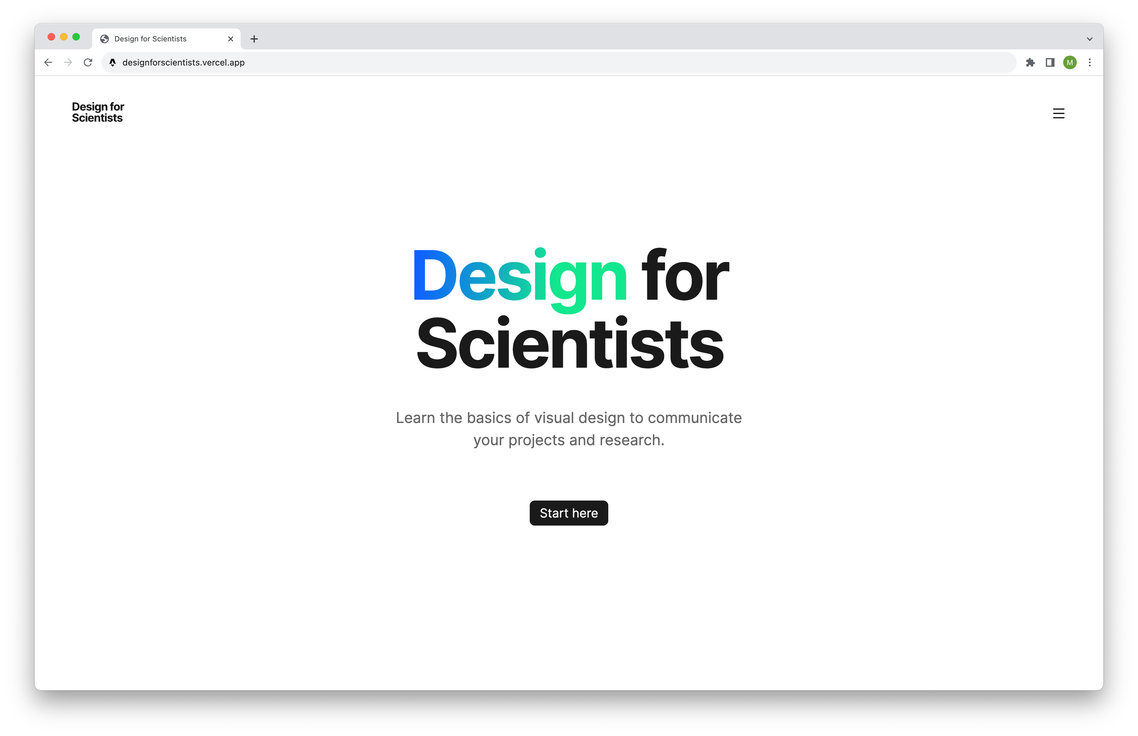
This week I was using Astro to build a new “Design for Scientists” website.
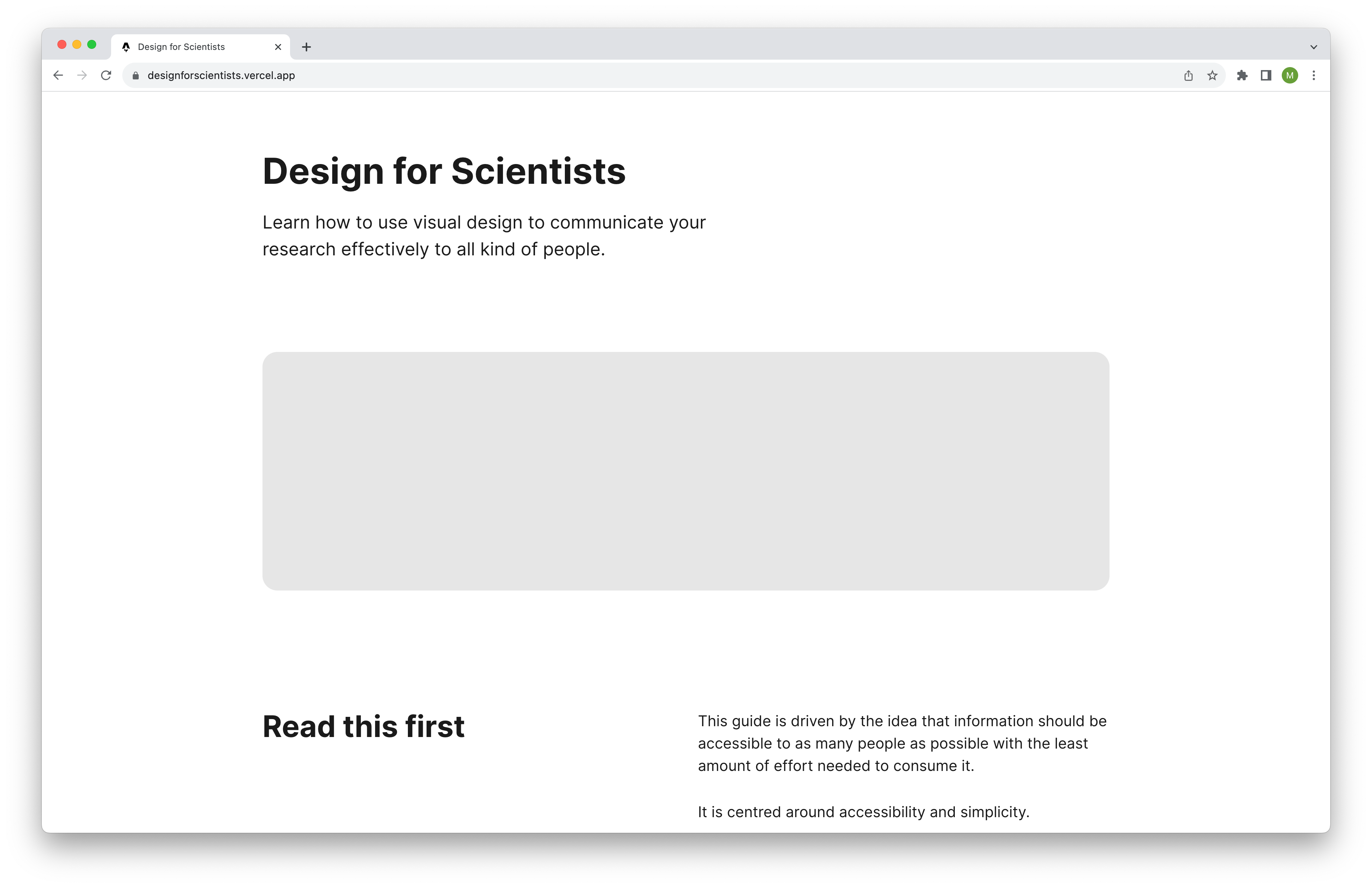
It is a resource for a course I teach at TU Berlin, with the goal of introducing upcoming scientists to the basics of visual design.
My objectives with the new website:
Update examples with clear guidance.
Improve Information Architecture and ease of use.
Optimise the page for mobile screens.
Update examples with clear guidance
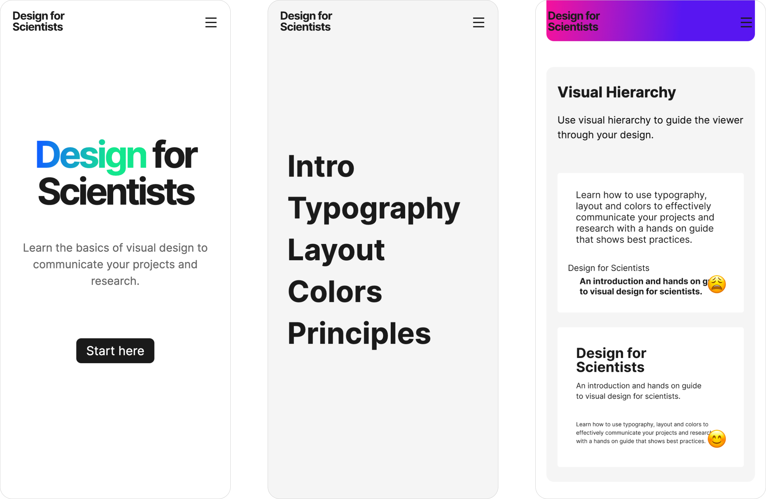
The first version had two examples side by side, marked with an emoji to indicate what’s recommended and what's not. It also had a short sentence on best practices.
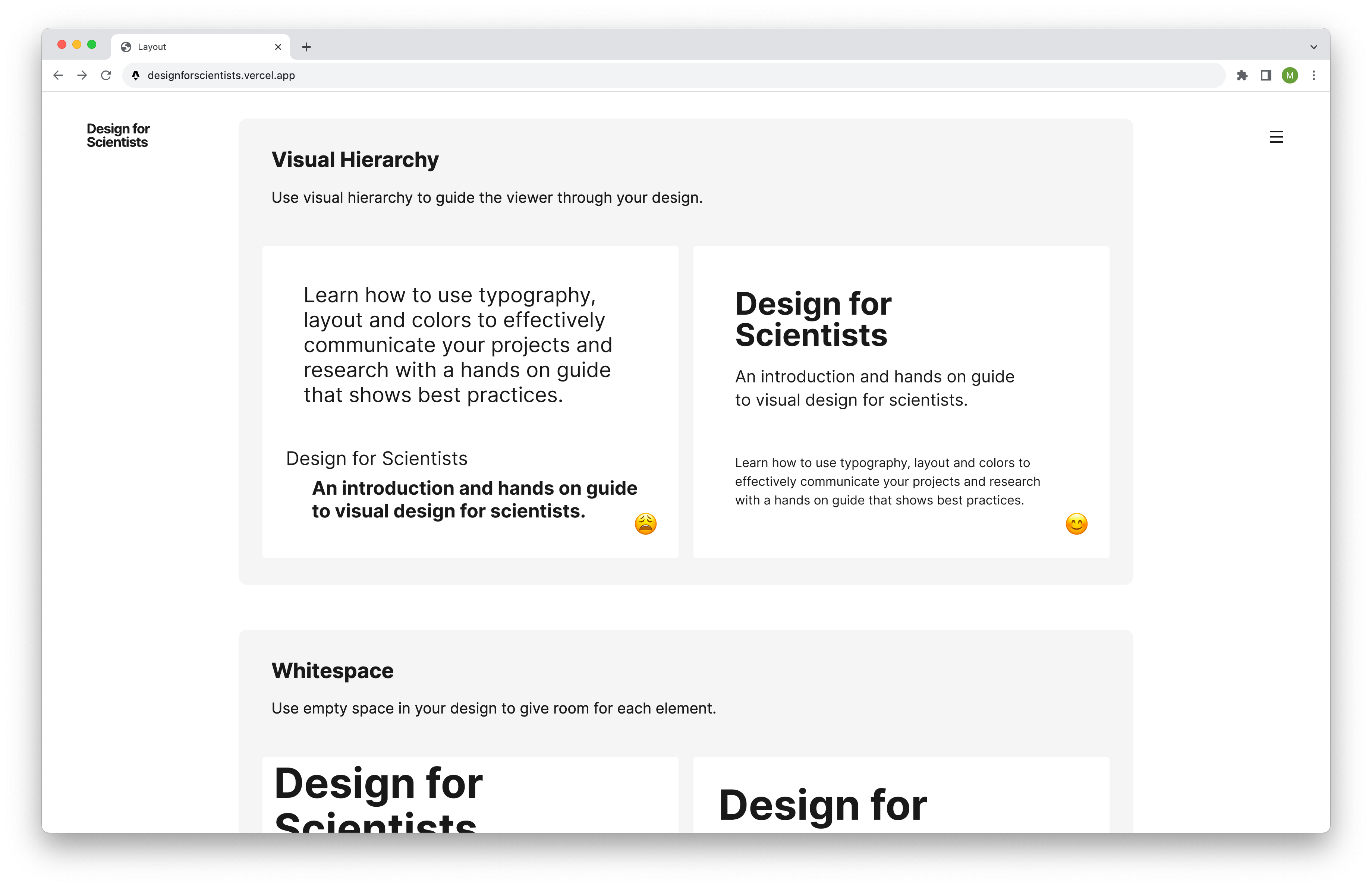
This made it hard for people to understand what they should avoid.
In the new version, there is a dedicated section for good and bad. It also explains why in more detail.
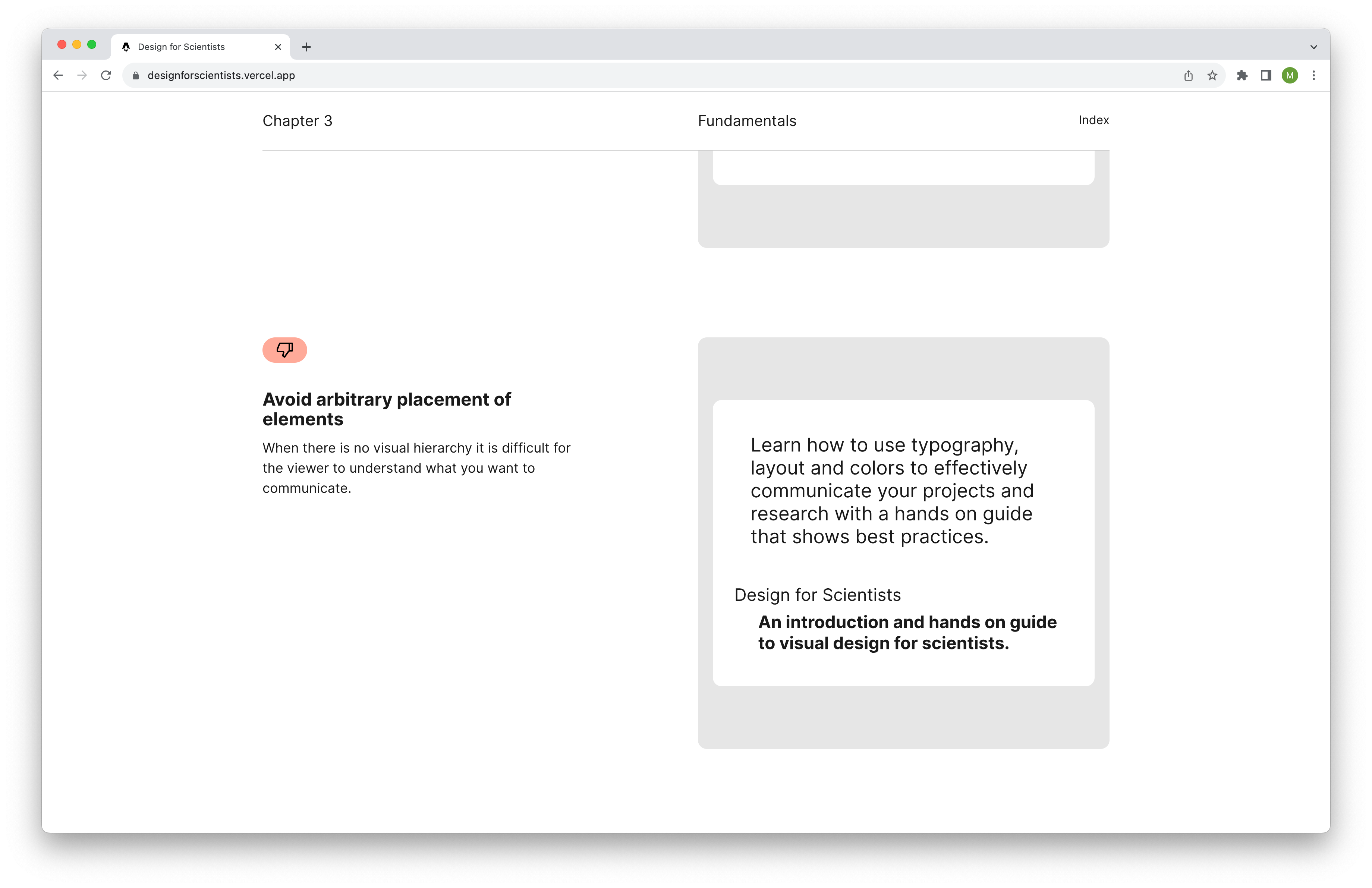
By doing so it helps people to understand better why certain things are recommended. It also gives some sort of instructions on both sides.
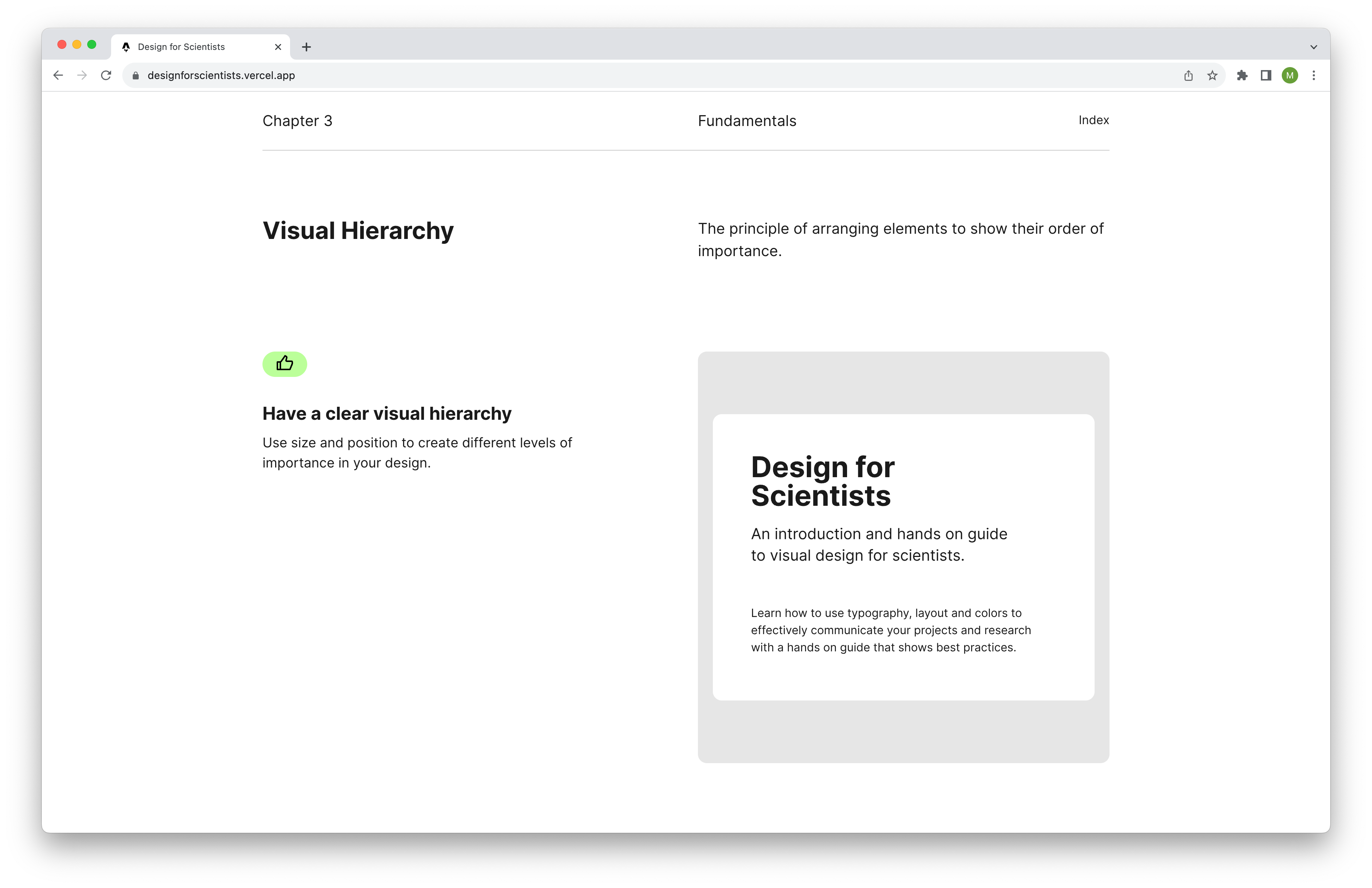
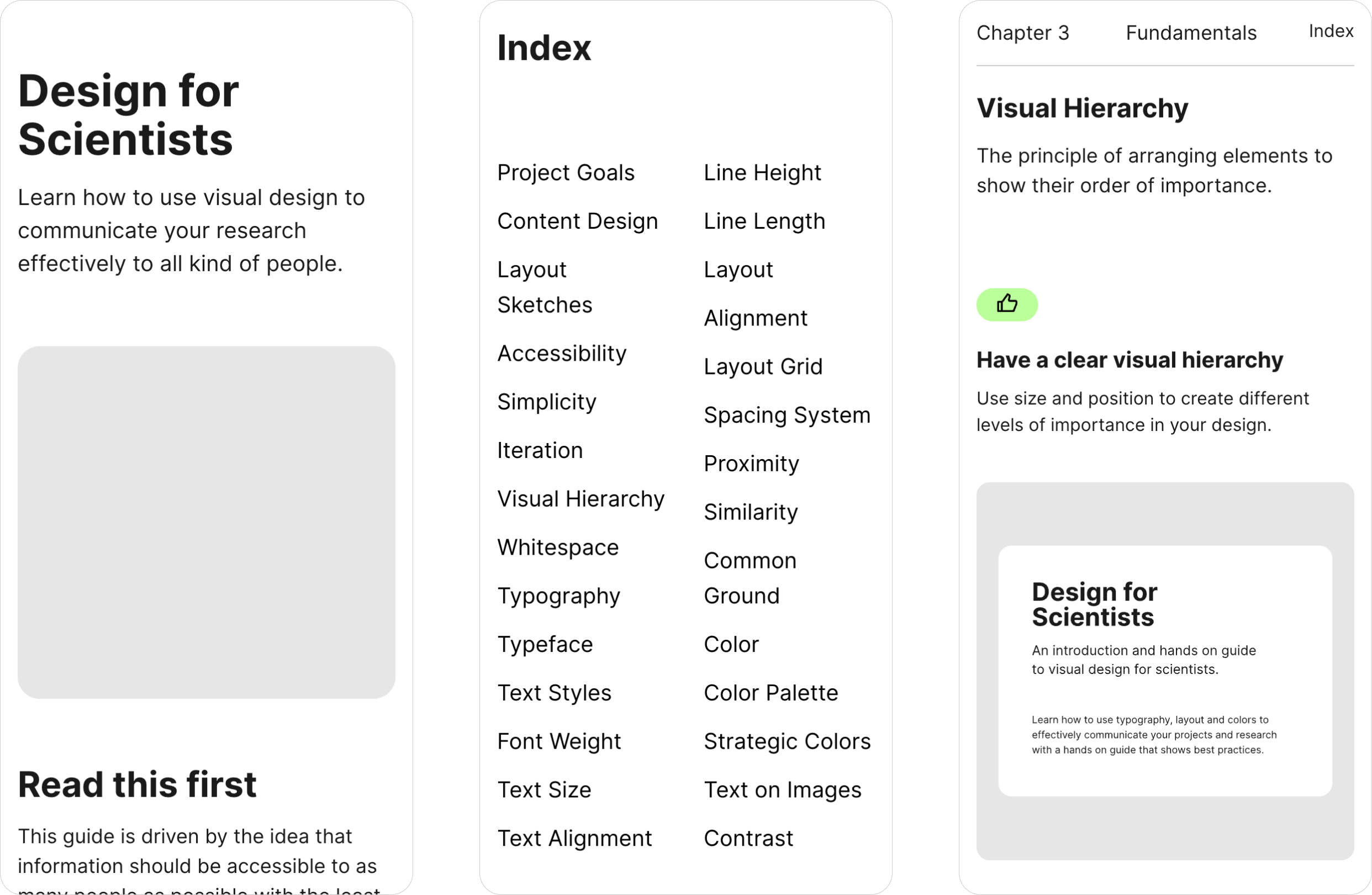
New information architecture
The old version had a landing page with a call to action that brought people to the first chapter, then each chapter had its own page.
There was a navigation to choose a chapter and a button at the end of each to navigate to the next one.
While this approach worked, it felt a bit like trying to sell you something. It was clear what to expect from the page and what you should do first, but required a few unnecessary interactions.
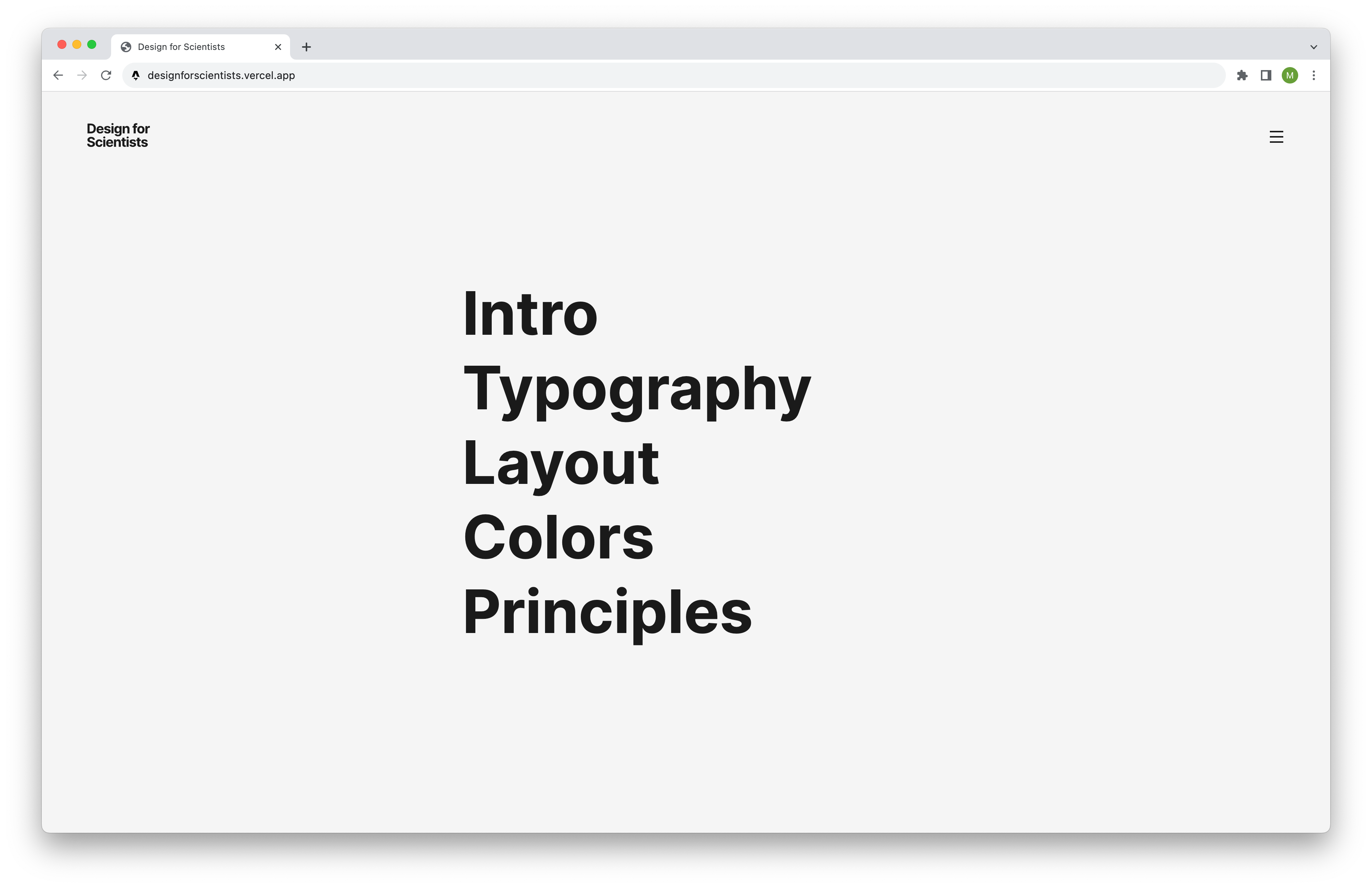
This led me to building the new guide as a one pager. So the only interaction the user has to do is scroll down.
To make it easier to find the desired piece of information I included an index, with all topics listed as anchor link for quick access. Also each chapter had a sticky header to show users where they are, as well as a button to go back to the index again.
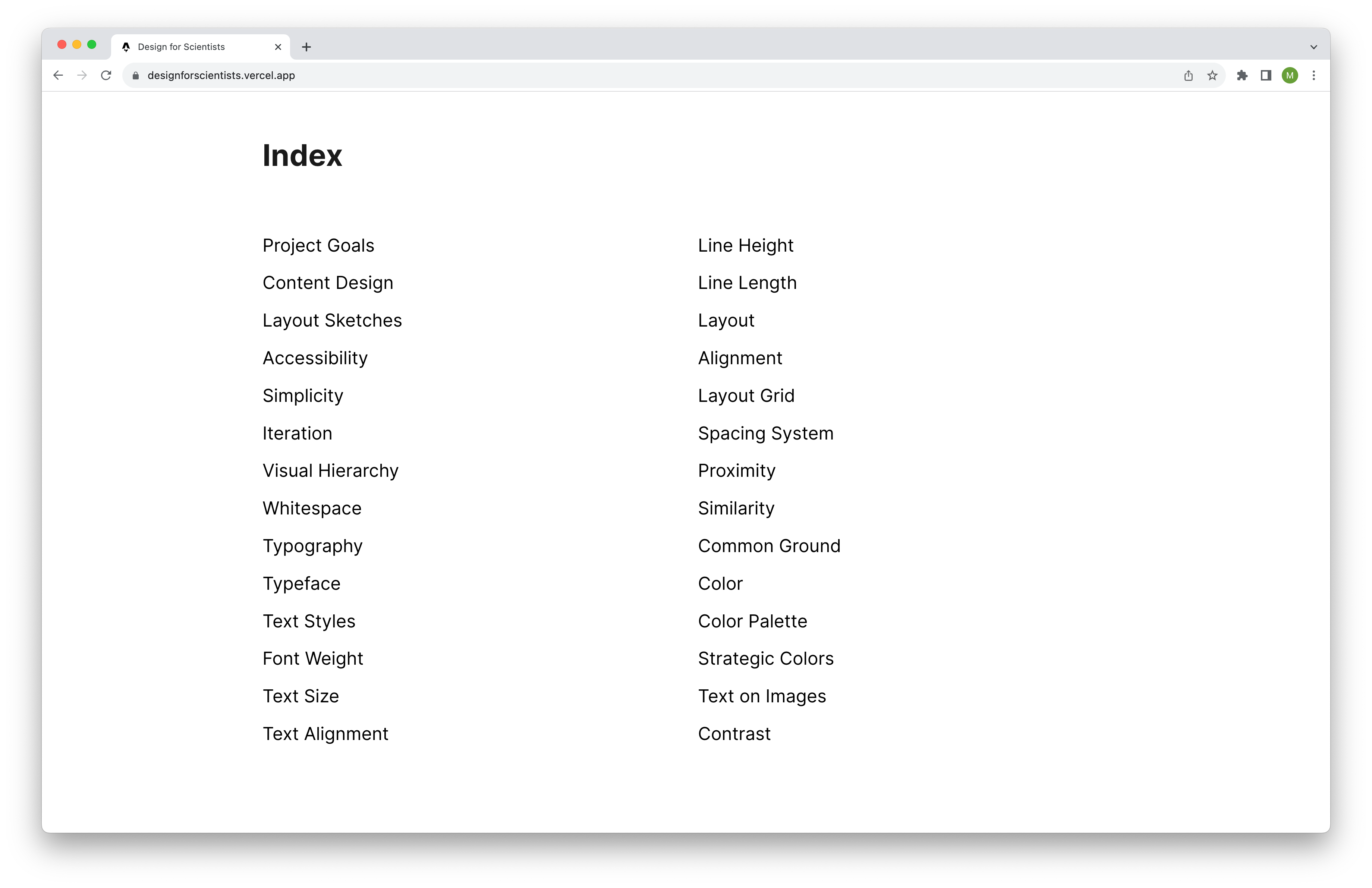
This makes all content more findable, since it is all on the same page. And you don’t need to check different chapter to see where things might be.
Optimising for mobile
The first version was working on mobile, but it felt a bit unnatural and especially the examples had a lot of information packed in one viewport.
The new version is more precise and has more space for the individual elements.
Though the index and sticky header certainly can be improved a bit.
Conclusion
It was fun to build the new page and I am quite happy with the result. I learned a lot on how to prepare the design in a way that speeds up the development process. And I am proud of myself that I am able to create such a page in a short amount of time using web technologies. Something that was out of reach for me not so long ago.
By doing projects like this I get deeper into all facets of building digital products which is a lot of fun.
Other things I did this week
Animations
Drawing
That’s it for this week. Hope you liked it.